Do you want to learn how to add more than one link to your Instagram bio? There are many bio link tools available — which one should you choose? Today we’ll compare Planoly’s Linkit with its most powerful opponent: MyList.bio.
Instagram as a business-oriented tool?
Instagram has attracted around a billion users from around the world. Some of them treat Instagram as a social media platform to share photos with their friends. Others try to become influencers and creators. However, a great number of Instagram accounts belong to businesses, enterprises, and companies. Those try to reach the young and impressionable audience and market their products towards them. Taking into account the global perspective, over half of Instagram population worldwide is aged 34 years or younger. Thus, they are the target of Insta social media managers and marketers.
Instagram can be a great tool for businesses that want to attract organic traffic, and showcase their products to a broader public. But, to really show your products on your website, you’d need a place on Instagram to put active clickable links in. Right now, the only space available for active links is a small section in your account’s bio.
Adding more links — how to do it?
Obviously, there is a way to fit more links into your Instagram bio, but it requires the use of a special app or tool. Such a tool will enable you to create a landing page, which is a standalone page that has been created specifically for you to adapt it to your needs. It can serve for advertising, marketing etc. That kind of page should allow you to represent your links in a visually attractive way: using pictures, photos, captions, buttons etc. If you’re not a programmer, it’s just not possible to design such a page inside your own website (without hiring someone to do it). That is why we use available linking tools: to help create perfect landing pages for enterprises, brands, and individual users.
In the next sections, we’ll take a closer look at two such tools available on the market: Linkit and MyList.bio.
Linkit vs MyList.bio — similarities and differences in design
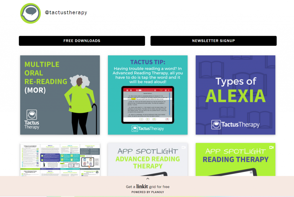
Focusing on the design and how both Linkit and MyList.bio websites look, one can definitely see a lot of similarities. First of all, both are very much focused on the visuals, unlike, for example, Linktree. The user has square tiles to fill with pictures, photos, and other types of images. They create the grid of the minisite and set the tone for the whole page.
Therefore, it can be said that the user has complete creative freedom in both apps. The grid is roughly the same, and your images are what is supposed to make your landing site pop.
Both tools let you upload a profile picture that you wish to represent your ministe.
Differences
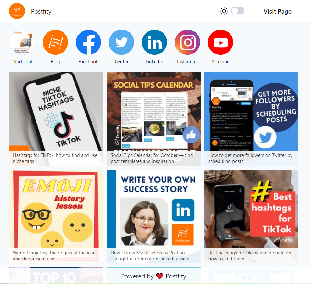
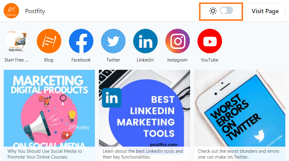
As one can see in the screenshots, MyList.bio has a special translucent space for captions in desktop view. That allows the user to add text that wouldn’t fit in the picture. That would come in handy especially if we link to articles on our blog.
What is more, Postfity’s MyList.bio lets the user choose their own pictures for their social links (there is an image library to choose from, too). The buttons provided by Linkit are more simple and only let one pick a colour, not an image.

Additionally, Postfity has a separate “Visit Page” button at the top, so it can be easily identified, and you don’t have to search for it.
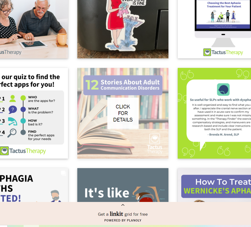
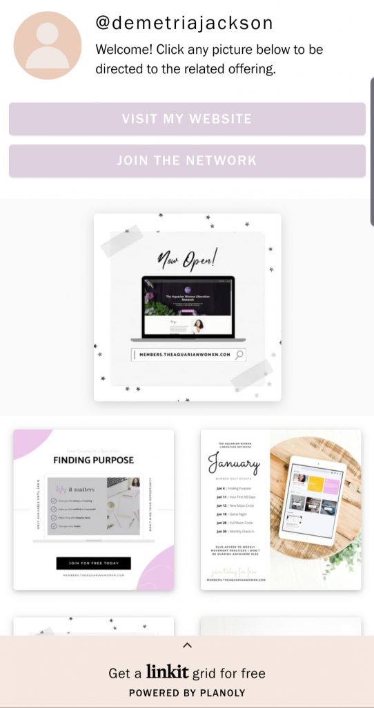
What is also different, when you hover the cursor over a tile in Linkit, a big square saying “Click for details” appears.
Other features
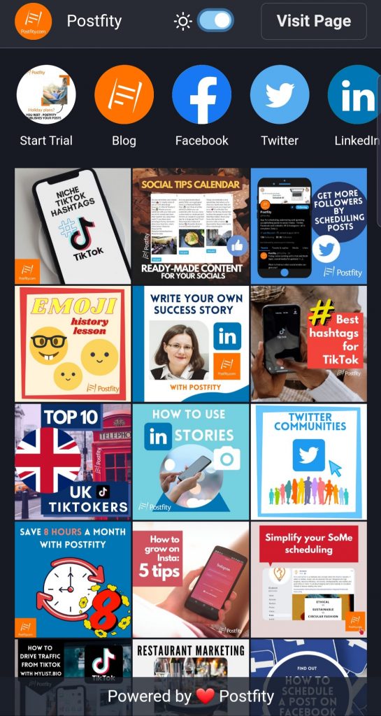
Postfity allows any user that accesses the minisite to select whether they prefer the light mode or the dark mode with a simple switch at the top of the page.
Linkit vs MyList.bio: mobile view
There’s a pretty big difference in the mobile versions of Linkit and Mylist.bio. Linkit opts for a more open and segmented view, while MyList.bio keeps the tiles closer. However, the functionalities remain the same: you click the tiles/buttons and thus activate the hyperlink. One other difference is that Planoly’s Linkit offers a section for a short general caption at the top of the minisite.
As regards the social links in MyList.bio’s mobile version, you can swipe to the right or to the left to see the remaining links.
Linkit vs MyList.bio: User-friendly interface & tutorials
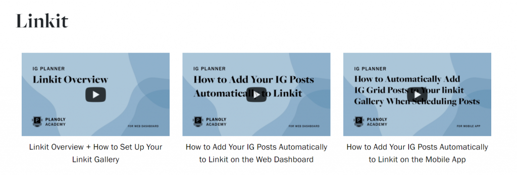
How easy is it exactly to make your own Linkit minisite? If you are new to the app, it may be difficult for you to navigate it. Planoly has published a few official video tutorials as Planoly Academy. MyList.bio has a tutorial available on their YouTube channel as well.
Postfity’s tool was created with accessibility and usefulness in mind. As you can see in the Knowledge Base, Postfity provides a step-by-step written tutorial with intelligible screenshots, and a video tutorial as well. Therefore, if you’re new to Postfity, it will still all be smooth sailing, because you can fall back on the resources whenever you need them.
Additionally, there are tooltips under the edit boxes in the tool itself and if you’re not sure, you can always take a quick look at the article and the screenshots. Postfity Team has done the absolute most to ensure that users have the best experience possible.
Analytics for your account: MyList.bio
What is the most important in a brand’s social media venture? The results that you can easily check and see, of course! In any campaign, only the outcome matters. Instagram lets you measure statistics if you have a business account, but only for… well, the account. Now what about the link in bio tools? Linkit doesn’t mention any analytics for the tool at all on its website.
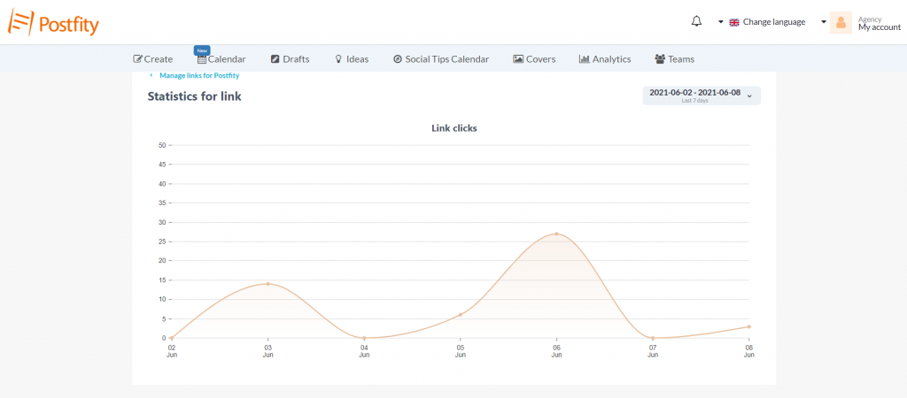
If you want to see the data for the landing page that you’ve put in your bio, you will need MyList.bio. In the panel you will be able to see how many people visited the landing page in any given period (you can choose the dates). Moreover, there are statistics for each social link and each link that you’ve put on the minisite. There’s also a separate section for top clicks on links.
A universal link in bio tool?
Do you want to create more accounts that are customized to suit your needs? Make a MyList.bio for each social channel. After you join Postfity, you can make as many accounts as you wish. Make customized minisites that best fit the profile of the chosen social app and put the customized URLs in Instagram or TikTok bios.
Linkit vs MyList.bio: pricing
As regards Planoly, in all their plans except the custom one, you can only upload images, videos, and GIFs to either Pinterest or Instagram. Unfortunately, there can be only 1 user and 2 social profiles in most plans. It’s true that Linkit is available in the freemium version, but you can still only upload to Instagram and Pinterest, and only make 30 uploads per month. Moreover, you cannot plan your communication for Facebook, Twitter, or LinkedIn separately, nor upload cover photos.
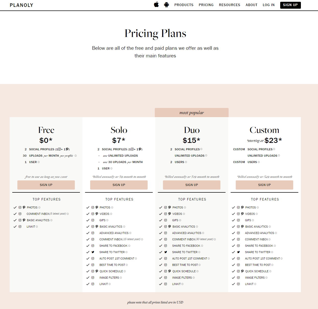
So yes, Linkit is freemium, but it’s still only a linking tool. MyList.bio is available in all Postfity plans, which means the social media scheduling tool and the linking tool come together in a package. For just $14.99, you get a powerful duo of social media tools that will allow you to organize your work and save time! Read more about all the functionalities of Postfity and learn how to schedule a post here. Postfity works with Facebook, Twitter, Instagram, LinkedIn, and VKontakte.
[reblex id=’20012′]
Linkit or MyList.bio: Which one should you choose?
To help you make the decision, we’re going to recap all the assets of Postfity’s MyList.bio:
- It’s very user friendly (plus you can see how it works in the tutorials before the purchase).
- You can create separate, customized minisites for each social, such as Instagram, TikTok or YouTube.
- The user has the full control over the visual aspect of each linking tile, and therefore, the whole page.
- Similarly, you can insert any images you’d like for your social links (Facebook, LinkedIn etc.).
- It’s very easy to add new links and make any update.
- The intuitive interface will let you switch the tiles in no time, rearrange them and change their captions.
- One can create as many accounts as are necessary.
- You can easily access the analytics for each account and link. See page views, links clicks, and social links clicks. Moreover, the analytics for each account let you measure where the traffic comes from (e.g. from TikTok or from Instagram).
[reblex id=’20088′]

