It`s commonly known that Facebook advertising is one of the most popular and preferred methods of paid advertising in the marketing industry. Facebook has developed an unstoppable and incomparable platform for paid advertising that, through proper design, technique and copywriting and ad can develop a tenfold return on investment. Sadly, according to a study, only 4% of small businesses are actually utilizing this feature.
This statistic could be so low since many companies and bloggers alike are asking “How do you even design a Facebook Ad?” This hurdle is one that many companies broach and quickly attempt to avoid. If you are ready to conquer and rise above the status quo – keep on reading! Today, we are going to explore how to design a successful Facebook Ad! Match these designs with a proven audience and watch the success flow!
Step #1: The Graphics Game
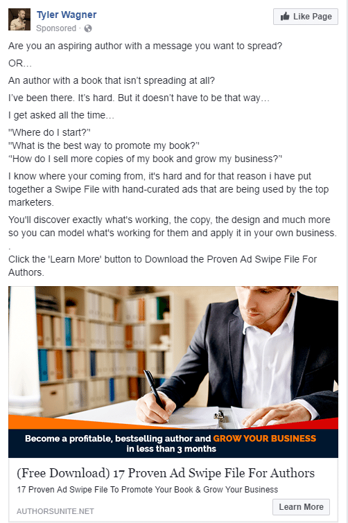
The first step in developing and designing a successful ad comes down to what we call “The Graphics Game”. Without proper attention-seeking images and graphics, your ad on Facebook will be considered invisible. It’s imperative to develop, create, or find images that match your brand and also will capture the attention of the millions of people scrolling through Facebook. Let’s take a look a two successful Facebook advertising campaign graphics:
There is always something unique about successful advertising campaigns, that, when seen, there is a level of professionalism and beauty in their graphics. If you want to get a better look at more beautiful samples, click here for over 24,166 Facebook Ad examples.
Step #2: The Call to Action Game
Step #2 is considered one of the most important steps in the entire process of designing a successful Facebook Ad. Why? Without a catchy and directive Call to Action, or CTA, you can kiss your leads, conversions, or likes goodbye! The whole purpose of the CTA is to provide guidance, direction, or instructions to the viewer. Once you do this, the reader should understand:
- What value they are attaining from your ad.
- What they exactly need to do in order to attain the value or information.
More than likely, if you are already in the market of advertising or digital marketing, you are quite familiar with the Call to Action Game. What you might not know is, through a successful CTA, that this can completely shift the direction of leads and conversions from 25% to 65%, for example.
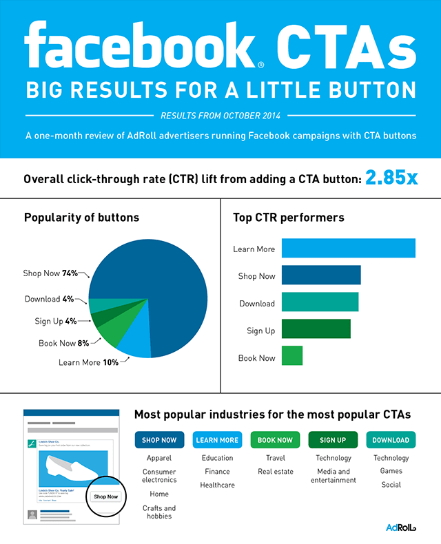
Now, there are multiple forms of utilizing Call to Actions. With the recent advancements of Facebook advertising, users can create campaigns with CTA buttons. In this, the average rates, by a simple button, have increased clicks by almost 3x than a simple regular button.
Step #3: The Word Game
Another CRUCIAL step of the entire process of designing a Facebook Ad is “The Word Game”. The word game is really all about the copy, or more commonly discussed as writing or text overlay. While graphics play an important role in attracting potential leads or likes, the words that are positioned on the graphics or above and below the graphics are going to be the driving force of entire advertisement. Without strong copy, an advertisement is weak and is bound for failure.
For more on the Facebook Advertisements and Text, click here!
Now, when it comes to text on the graphic, it’s important to know that Facebook has a 20% text rule, which can be quite a hindrance for text lovers. With that being said, this is intended to really push the advertiser to sell or push their ad with minimal wording.
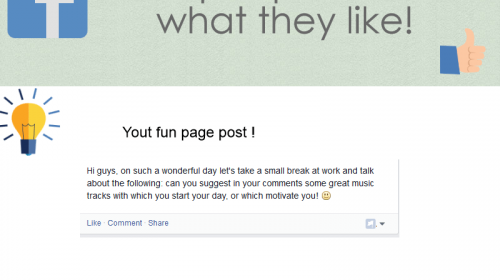
On top of this, the wording above and below are just as decisive. These are going to be the locations where the Call to Action is going to be placed, which we discussed earlier. It is suggested to try to reach an emotional level with the viewers as a method to interest them in clicking. With that being said, let’s turn the tables, how can you communicate with your audience and reach their emotions?
Check out these three awesome examples:
Your Advertisement is Developed!
First and foremost, congratulations on developing your official future successful Facebook Ad. The truth is, once you understand the basics of a Facebook Ad, most of this will become second nature. While these are three basic steps towards developing a Facebook Ad, there is still much more that you can to do stand out. For example, try using programs like Canva or Photoshop to develop the highest quality graphics. It does not stop there! To better prepare you for your Facebook Advertising Journey, check out this handy guide on designing Facebook Ad.
