Have you been wondering how to add more than one link to your Instagram bio? There are many freemium bio link tools available on the market. Is there an alternative tool to Linktree for Instagram and Linktree TikTok? Today we’ll compare Linktree with its most powerful opponent: MyList.bio.
Instafacts
First of all, Instagram is a completely different platform that Facebook, Twitter or LinkedIn. It has very different mechanics and the visual content is key. Until the end of June 2021, everybody was convinced that photos were the desired and promoted content on Insta. Well, that’s true, but newsflash: Instagram is about to make some big changes. The platform will be shifting its focus to the video content: stories, IGTV and Reels become more and more popular.
Instagram boasts around a billion users from around the world. Moreover, taking into account the global perspective, over half of Instagram population worldwide is aged 34 years or younger. Over 23,4% of women aged 25–34 distinguished Instagram as their favourite social media platform. Additionally, in 2020, the app ranked third among U.S. teenagers after Snapchat and TikTok.
Adding more links — how to do it?
Although you can’t do it without some professional help, there is a way to fit more links into your Instagram bio. You will need a landing page, which is a separate page that has been created specifically for marketing purposes or an advertising campaign. There you should be able to fit whatever you want to represent links: pictures, photos, captions, buttons etc. Designing the page yourself can be quite difficult if you’re not a programmer. That’s why new tools are being released to help create perfect landing pages for enterprises, brands, and individual users.
It’s up to you to decide what feature is the most important to you. Let’s take a closer look at the two selected tools available on the market.
MyList.bio vs Linktree #1: Layout
What is the first thing that you think about when designing a landing page? Of course, it’s the layout of the page! It must be user-friendly for both desktop and mobile users, but that’s not all. You have to take into consideration: what do viewers like best: pictures or captions? Don’t you think that simple buttons with a caption are outdated? Moreover, they don’t instantly capture the user’s attention. A page with a few buttons and virtually no visuals is just sad and boring.
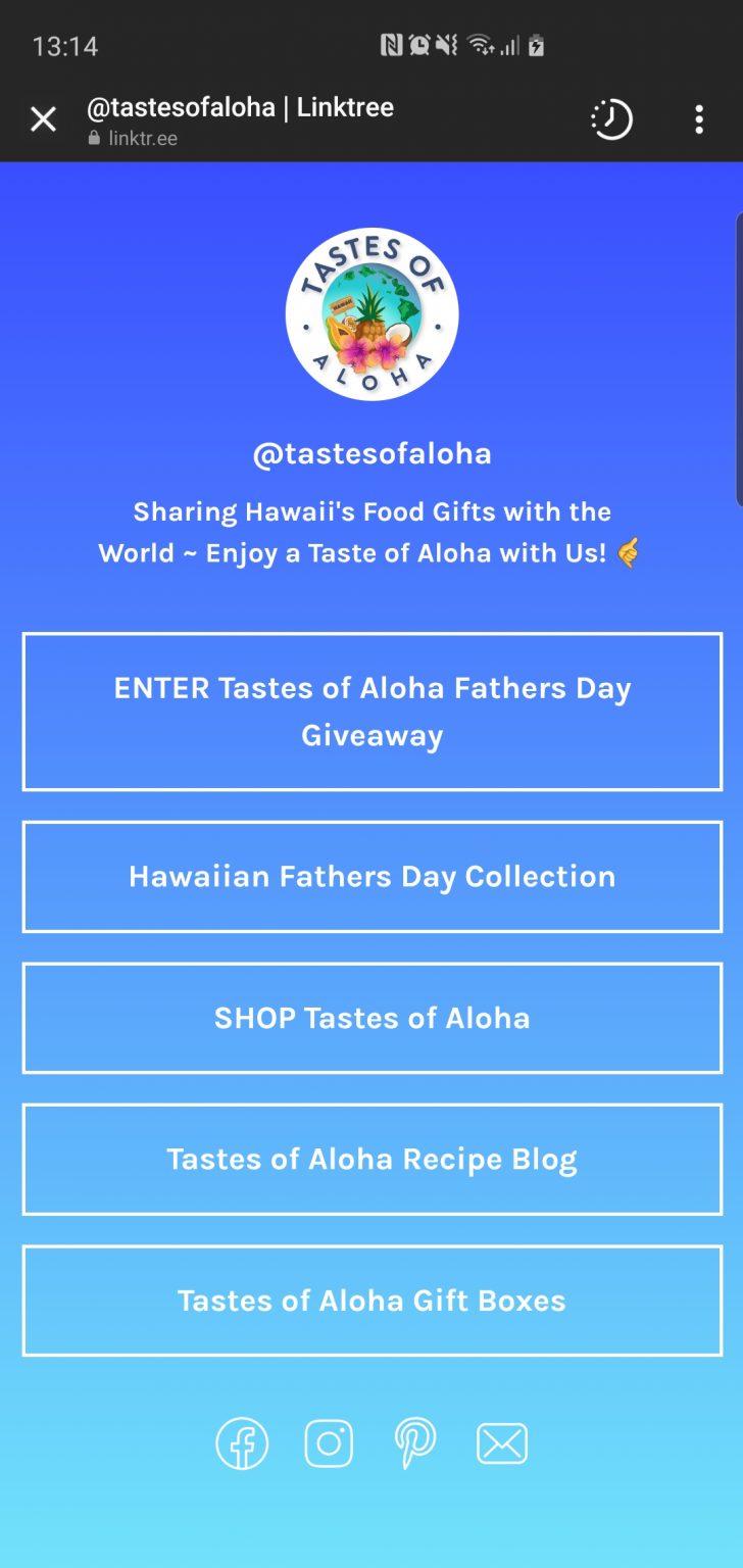
Unfortunately, if you decide on a free Linktree account, that’s what a typical page will look like. Just plain buttons with a background. Nothing distinguishes each section nor the landing page itself. The only graphic element is the logo.
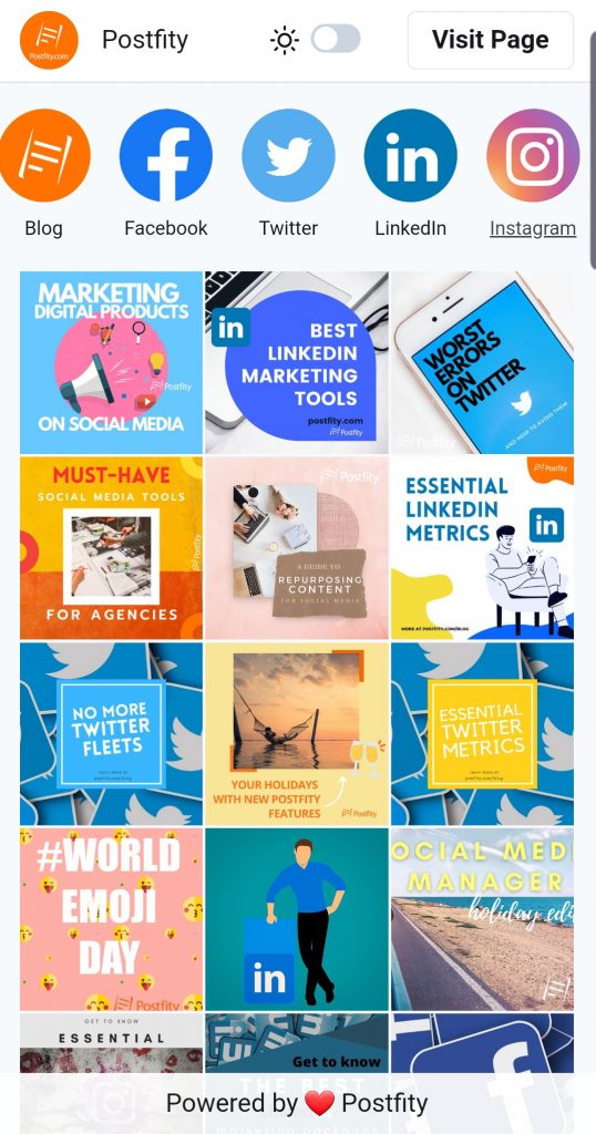
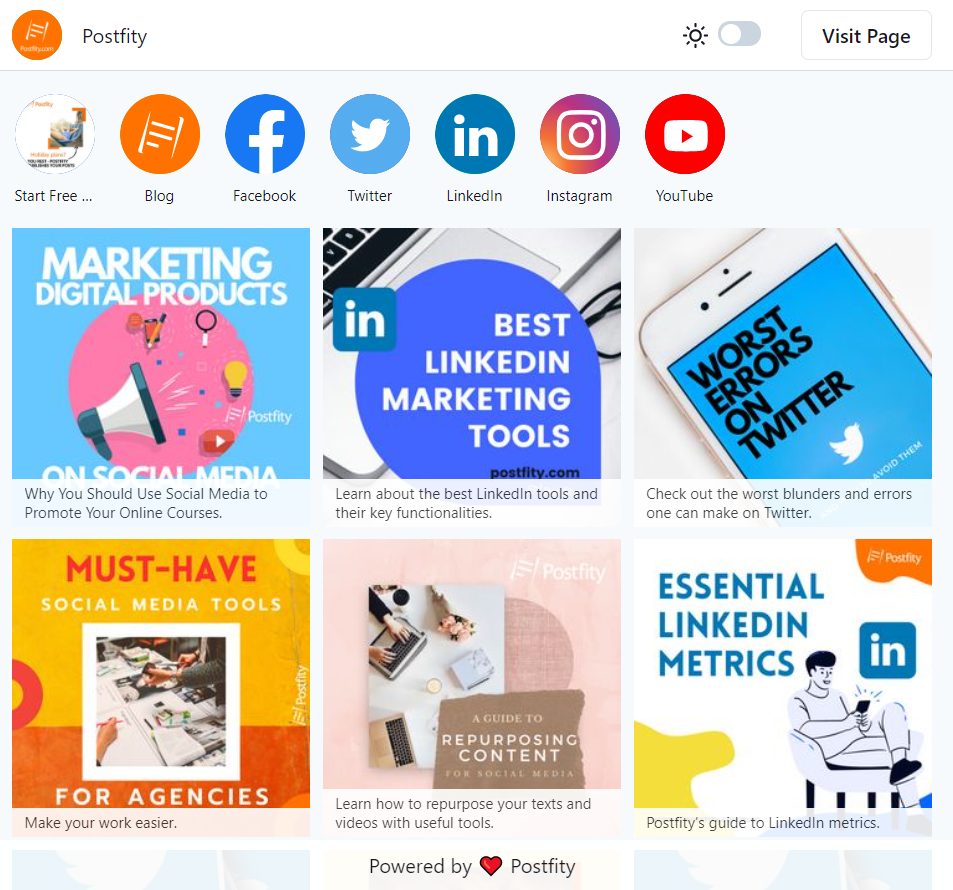
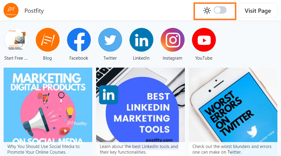
Postfity offers you the ability to create as many MyList.bio accounts as you wish with the visuals you choose. You decide how to fill in the tiles and whether you want normal or custom icons for your socials. Take into consideration, that titles and captions appear only in the desktop version of MyList.bio, and that in the mobile version the picture has to say everything you need it to. Remember, everything is, of course, clickable and leads the customer/user directly where you want.
Another thing, your “Visit Page” button is clearly visible at the top of the landing page.
With MyList.bio, you can make anything stand out.
Socials
Pay attention to how the other socials are barely visible in Linktree. Truly, it’s difficult to even notice them at the first glance. In MyList.bio your socials are at the top of the page, and they are clearly distinguishable. In addition, you can customize their icons to fit the style of your landing page and your brand.
Light mode and dark mode
MyList.bio allows you and everyone that clicks in your link, to quickly change from light mode to dark mode and the other way around. Linktree stays generally the same at all times.
MyList.bio vs Linktree #2: User-friendly interface & tutorials
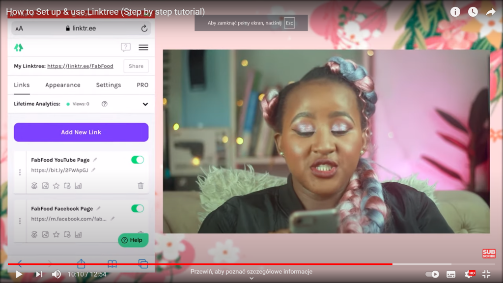
How easy is it exactly to make your own Linktree page? Well, there are the usual steps like signing or logging in, and then… what? If you are new to the app, it may be difficult for you to navigate it. Sadly, Linktree hasn’t published any official video tutorial anywhere and they are counting on random youtubers to do it instead.
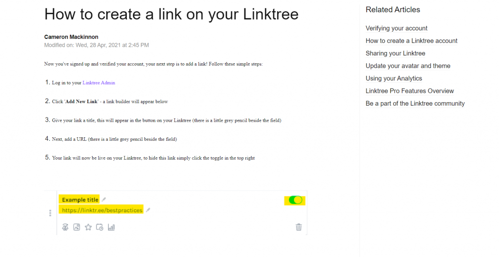
Moreover, Linktree’s FAQ page is seriously lacking. What’s missing? Well, both the copy and the visuals are lacking, when it comes to Linktree’s Support page. You can see it by yourself or look at the screenshot.
As you can clearly see, Linktree has a mobile-friendly interface with a good UX design that lets the client use the app easily on a small screen. The only drawback is that the icons don’t mean anything to a newcomer, and it takes some time to learn them all. One feature that is definitely a plus is the option to enable or disable a link without deleting it. Furthermore, there is a clear-cut division between the sections “Links”, “Appearance”, and “Settings”. There is also a handy “Share” button.
MyList.bio’s functionality and practical tutorials
Postfity’s tool for creating minisites balances visual accessibility and usefulness. First of all, the MyList.bio takes into consideration the possibility that you will probably want to create multiple accounts. It’s much better to make separate accounts for Instagram and for TikTok. With individualized accounts you could easily measure the traffic via MyList.bio analytics. Secondly, as you can see in our Knowledge Base, we provide a step-by-step written tutorial with intelligible screenshots and a video tutorial. Therefore, if you’re new to Postfity, everything will be easy to understand and you can fall back on the resources whenever you need them.
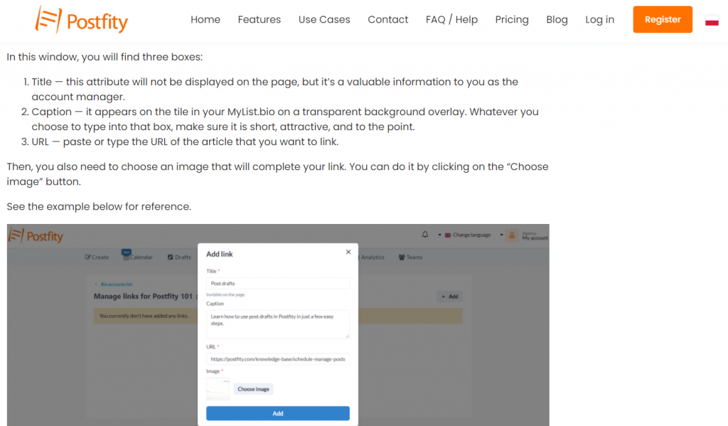
As you can see in the linked tutorials, MyList.bio’s interface is simple, but not simplistic, and helps navigate the tool easily. Since everything is so clearly labelled, you can just read your way through the first use. There are tool tips under the edit boxes in the tool itself and if you’re not sure, you can always take a quick look at the article and the screenshots. Postfity team did everything to ensure that users have the best experience possible.
Linktree for Instagram and Linktree TikTok?
If you want to have more accounts, which are customized to fit your needs for each social channel — then MyList.bio will be your convenient alternative to Linktree. You can make as many accounts as you wish. Make customized minisites that best fit the profile of the chosen social and put the URLs in Instagram or TikTok bios.
MyList.bio vs Linktree #3: Which one should you choose?
Linktree has its assets, such as the ability to pay through the landing page and background customization (remember you have to pay for it – 6$ a month). However, it’s still just a linking tool. MyList.bio is available in a Postfity plan, which means the social media scheduler and the linking tool come together in a package. For just a few dollars more than the price of Linktree, you can get a powerful duo of social media tools that will allow you to organize your work and save time!
Let’s list MyList.bio’s assets once more:
- It’s easy to use and very user friendly (plus you can see how it works in the tutorials before the purchase).
- You can create separate, customized minisites for each social, such as Instagram, TikTok or YouTube.
- The user has the full control over the visual aspect of each linking tile, and therefore, the whole page.
- Similarly, you can insert any images you’d like for your social links (Facebook, LinkedIn etc.).
- It’s very easy to add new links and make any update.
- The intuitive interface will let you switch the tiles in no time, rearrange them and change their captions.
- One can create as many accounts as are necessary.
- You can easily access the analytics for each account and link. See page views, links clicks, and social links clicks. Moreover,the analytics for each account let you measure where the traffic comes from (e.g. from TikTok or from Instagram).

