6 Major Changes:
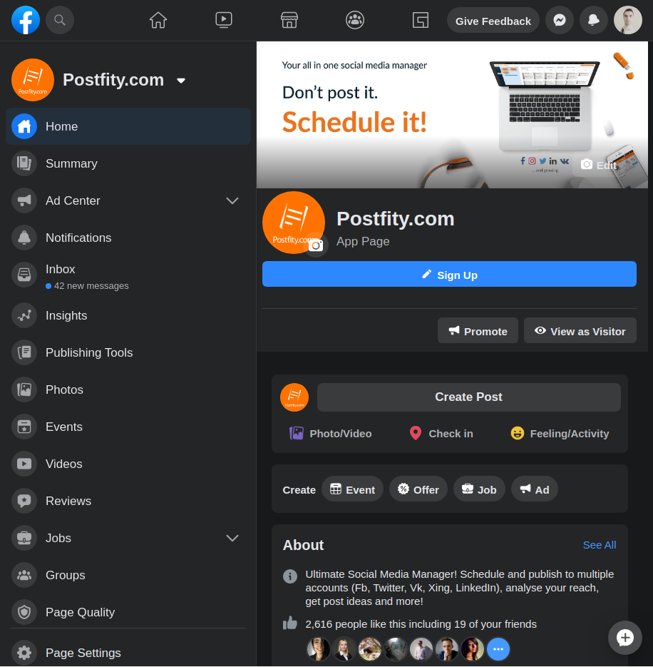
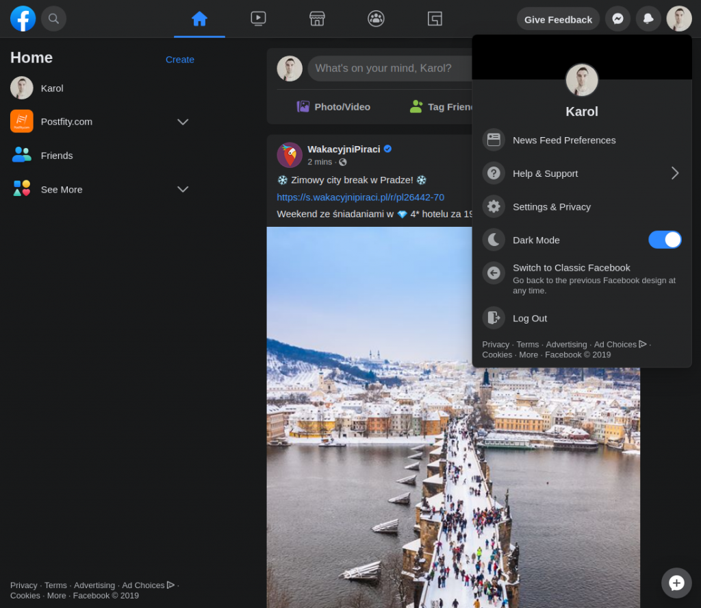
#1 Dark Mode
Facebook seems to have taken a leaf out of Twitter’s book by offering its new interface users an optional dark mode. The reason behind it is not purely esthetic – dark screens are said to be kinder to the eyes, do not cause that much disruption to our sleeping patterns (with blue light) and…help save your laptop and phone battery 😉
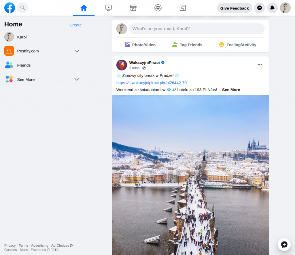
Here the comparison of the dark vs. light modes:
#2 ‘Pick up where you left off’ functionality
The new Facebook interface will allow you to ‘save’ the place where you last got to when scrolling – and pick up where you left off when you come back. Pretty useful if you want to react to a post or reply to a comment a bit later, but you need to go or get interrupted.
#3 ‘Cleaner’ Interface
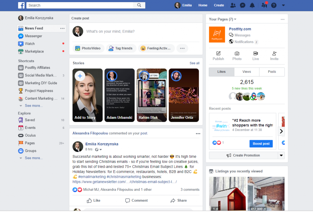
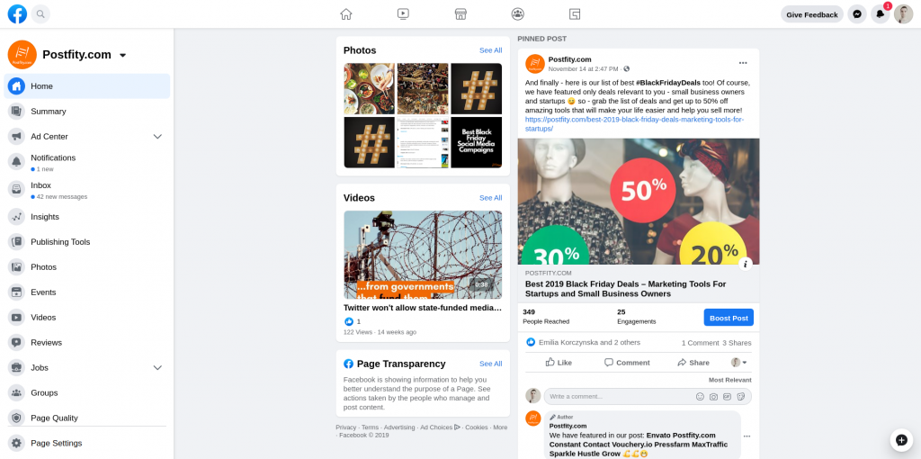
Generally, the new Facebook interface seems less cluttered – a lot of icons from the menu on left of the feed will disappear into ‘folders’:
Compare now:
#4 Instagram photos on pages
The new Facebook interface will also display Instagram photos on Facebook pages – from linked accounts.
#5 New Video Player
The new Facebook interface also got a larger, more YouTube-like video player:
#6 Overhauled Marketplace
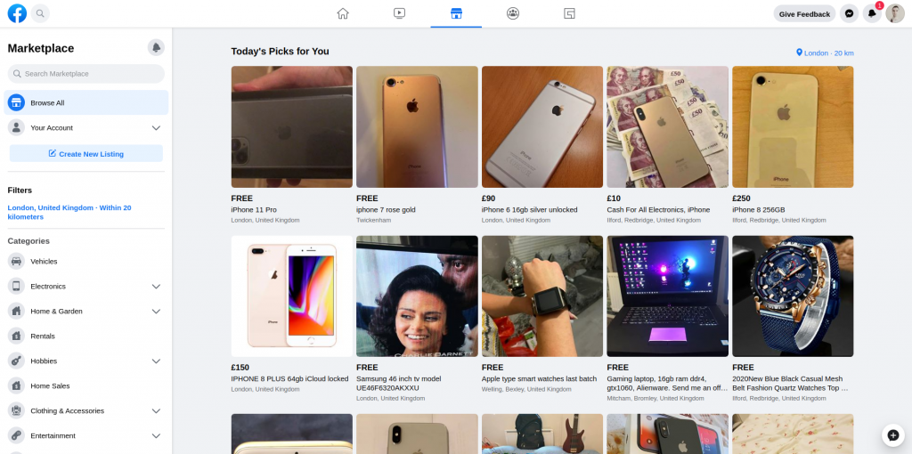
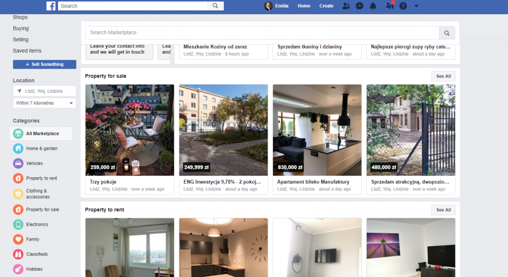
The Facebook marketplace also got a face-lift, with bigger photos of products and cleaner layout:
Cf. Now:
🤔Is it available for mobile as well?
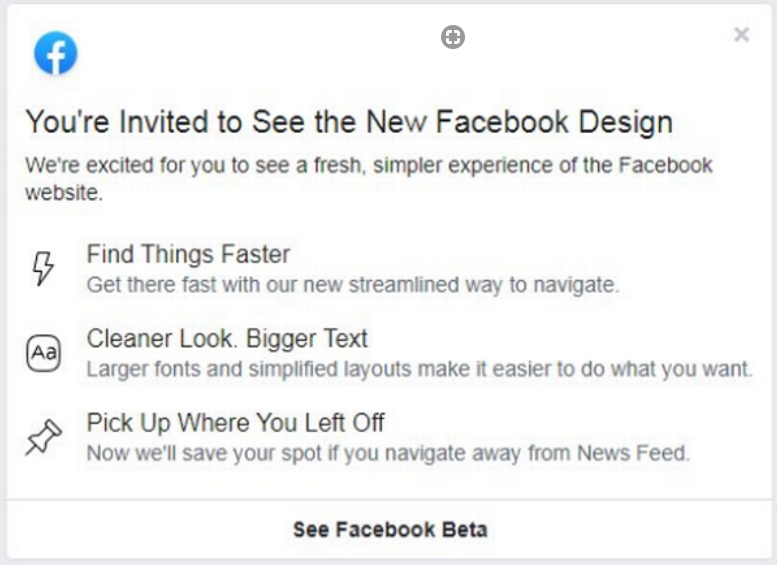
The new facebook interface is currently available only for desktop.
🤔 How can you switch on the new Facebook interface?
Currently you can’t switch on or apply to test the new Facebook interface.
How do you like the new Facebook interface? Or do you prefer the old one? Have you been invited to test the beta? Let us know in the comments!
